|
|
|
|
| ||||||||||||||||||||||||
|
Become a Patron! |
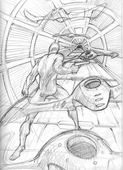
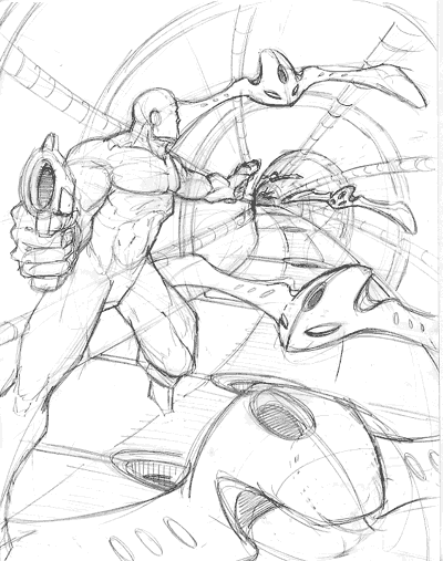
Art tips and techniques, reviews and interviews from my studio. Archived here and at World Famous Comics. Comics 101 for 06/03/2004 Advice on Dynamic Figure Drawing, Perspective and Light and Shade Mr. Corroney,Hi Jeremy This looks pretty good, the one point perspective is OK but the angle overall could be more dramatic. If your horizon line wasn't right at your character's eye level perhaps and maybe establish it higher or lower in the scene it could be more effective. Maybe if you even pushed a little three point perspective in there somewhere by lowering your horizon line. This would give you the opportunity to make for an even more dynamic/dramatic pose too. Looking at the 'back' your character pretty much positioned in the middle of your scene isn't as interesting as it could be. Move him abit more off center and perhaps make him a bit bigger to compensate for design dominance. See his arm holding that gun right dead center of your page? It becomes too much of a focal point and inhibits any dynamic movement in your composition. I would turn his pose slightly to give us a 3/4 view of some kind. Let's see a little bit of his face perhaps and a bit more side or front of his torso, just enough to make him more interesting to viewers but still keep him mysterious if that's your purpose. Also, I see a row of lights which could cause problems when calculating your light sources. If you don't disregard the two background lights, this would mean you would be working multiple reference points on the floor plane to cast shadows from and that could get confusing too quickly. Always keep in mind to have your light sources simple, dramatic, focused. It makes for more controlled, dynamically graphic art. In this case I'd remove those two extra light panels and work just with one, unless you leave them in there and just don't calculate (or guesstimate) shadows from them. I like your addition of the little robotic flying things. Just be sure to shade and light them appropriately according to your one primary light source. Good luck! Joe Mr. Corroney,No problem, Jeremy. This piece is definitely better than your first one and answers more of what I'm looking for in regards to the assignment but I could still see some room for improvement here and there. Though I'm really glad to see you are taking my advice to heart and implementing the changes. I'm looking forward to seeing the final artwork! Also, this week I thought I'd share an email from a fan and fellow artist looking to break into the business... Hi Joe,Hi Sean, Sorry for the late reply, been really busy with a few projects recently and I'm catching up on my email correspondence. In answer to your questions I'm going to point you to some links in my Comics 101 archives. In these interviews and step by step tutorials you'll be able to learn a bit more about me and how I got started in the business and how I got involved illustrating for Star Wars. I hope this information helps and good luck with your artwork... TheForce.Net Interview - Part 1 (02/21/2002) TheForce.Net Interview - Part 2 (02/28/2002) Designing Star Wars Aliens! (06/20/2002) Tips on Sending Portfolio Submissions in the Mail (11/21/2002) By the way, this weekend, June 4th through the 6th, I'll be appearing at ConCarolinas. The writer Guest of Honor for the show is none other than Alan Dean Foster. Also appearing at the show will be Star Wars Fanworks, the home for Star Wars Fan Audio, and the 501st Carolina Garrison Stormtroopers. If you're in the area or plan on going to the show definitely stop by my table since I'll have plenty of Star Wars artwork on hand and for sale. Hope to see ya there and see you next week for a new Comics 101 feature! -Joe Recent Columns:
© 2024 - , 153 Sheffield Way, Sandusky, OH 44870 All other ® & © belong to their respective owners. | ||||||||||||||||||||||||