Star Wars Fan Artwork Critique
Hi Joe,
You may have seen this posting on Jan Duursema's
message board, but I was wondering if you could
critique it for me.
I am in the process of illustrating death scenes of
Jedi from the New Jedi Order as a sort of tribute to
their last moments, be it glory, despair, whatever.
Their last stands.
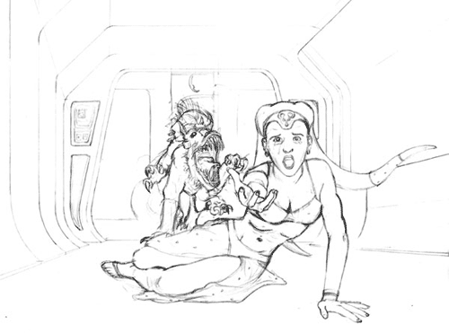
This is my pencil sketch of Jedi Knight
Numa Rar's last stand. She is reaching out to her
sister (the viewer) as a voxyn is trying to kill her.
I haven't included it in the sketch, but part of her
body will be melting, burned from acid.
My scanner did not pick up on the pencil as well as I
would have liked, so I had to manipulate it a little
in PhotoShop. The background is the interior of a
ship. To Numa's left is a large viewport overlooking
the stars.
If you could let me know what you think, I'd really
appreciate it. I'm going to ink it once I've nailed
down all the suggestions people have, and I think I'll
end up coloring it in PhotoShop, as opposed to my
usual TRIA markers. Your tutorials are a huge help!
I'm going to give your technique a try.
Thanks, Joe. Hope to hear from you soon,
Frank
Hi Frank,
Sorry for the late response. It seems like one project after another has been kicking my butt lately for the past few months. Besides doing my regular Star Wars art for Insider I just started working for Moonstone on a comic book for them about a month ago.
Anyway, I wanted to let you know I thought your artwork looked great and I'm really glad my tutorials have been helping you out. Have you finished this or any of your other pieces in this series in color yet? I'm anxious to see how they turned out.
In regards to this art, my main critique would be that the straight on angle you chose to go with in the one point perspective seems a little flat for a dynamic action scene. Because of the camera angle we can't feel the ferocity of the beast as powerful as we could because he's smaller and in the background. If he was made to look larger, maybe jumping over the Twi'lek, looming over her in this viewpoint as he is about to pounce on her that could be beneficial. Even possibly by rotating the camera angle slightly from the straight on viewpoint to a 3/4 view your scene would have more depth with more of a sense of perspective and not seem as flat. It would also even heighten the intensity I feel since we would be seeing a bit more of the side of the creature and he would seem larger and be a bit closer to the mid-ground.
I love the drawing, pose and expression on Numa though. Good, realistic and controlled foreshortening on her hand and arm. That's something even really skillful artists have trouble pulling off believably without it looking too exaggerated or 'cartoony'. Numa really turned out great. Perhaps even if you had her head turned slightly so we can feel a connection between her and the animal as she reacts to it showing that she knows her end is near it might give the image more of a sense of despair or dread too.
Keep up the great work and I look forward to seeing more of your work (and this piece in color!)
Check back here next week for a new Comics 101 feature!
-Joe